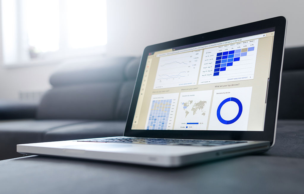
Do you know what user friendly web design feels like? It’s a quality that all of us are looking for. A user friendly design helps us chug along on our journey towards solving our problem.
You can certainly tell when a website is not user friendly. When the website fails to show you what to click next, it feels like hitting a wall. On the other hand, a user friendly website immediately gives you just one thing to focus on. It feels like an open door.
Your website should be on the same team as your customer. They’re looking for something and you’re there to guide them to it. That might be a purchase, a donation, a sign-up, or maybe just your phone number or address before a walk-in visit.
Let’s explore some websites that are great at being user friendly. And we’ll take notes on the elements that really make them work so you can see how your own web design stacks up!
Punchy Verbs Activate Versus Arthritis
The first thing I noticed when I arrived on this website was the incredibly bold and defiant expression of the woman in the first picture. This image sets up Versus Arthritis as an activist organization that opposes a sinister disease. They make supporting medical research feel like a street protest.
https://www.versusarthritis.org/
 Each section of this page is also very tall. There’s a lot of space for each chunk of information. As you scroll down, it’s almost like they have chosen to feature one thought or one main idea for every turn of your scroll wheel. I really like this. Users skim and scroll through homepages. They are not reading deeply. Match your web design to their behavior and users will get more out of your content, helping them enjoy your page and find a satisfying “next click”.
The second thing I noticed with this web design were the active verbs used in the menu navigation and throughout the website. You’re always clicking “Get” or “Watch”, “Add” or “Donate”. They really like telling you what to do! And I like it. Users scroll through Instagram for mindless entertainment. They’re on your website to check something off their to-do list. Show them what they can do on your site with crisp, clearly presented action verbs.
User friendly elements:
- There is a clear mission/purpose for the website
- Large, easy to read information chunks.
- Navigation text uses active verbs.
Clear Paths Make Oscar Easy
Oscar is a health insurance company that serves both individuals and companies looking for employee coverage. Both audiences are important, but they need very different information. Since Oscar only has one homepage, they start the page with a great big sign pointing users to the right path.
 The requirement to serve two audiences could dull the impact of their homepage, since they must use two images and two top headlines. But they pull it off! Oscar knows that users are looking for insurance quotes and there are only two types: insurance for you and your family or insurance for your business. The choice is clear and presented in as few words as possible. You don’t even need to read.
The image choices show a young girl with a band aid for the individual option and two clasped hands for the group option. Websites feel user friendly when using them feels automatic, like you barely had to think. Repeated, identical action buttons make it clear what you need to do to join Oscar. Remember, this is health insurance. Nobody thinks it’s fun. Oscar’s friendly illustrations keep the tone light-hearted while the simple choices keep you focused on taking care of business.
User friendly elements:
- Distinct information paths for different types of users. Path choice given at the top of the page.
- Friendly images reinforce the text information.
- Repeated action buttons keep the user moving towards a solution.
Simple Site Search Helps TYLA Help You
The Texas Young Lawyers Association is devoted to helping Texans learn more about the legal system and achieving justice for all. Their website offers information for its members, but is primarily a library of legal resources on a variety of topics.
Like Versus Arthritis, the TYLA web design is dominated by a stirring image. This time it’s the Texas state flag rippling in the wind, presented in a silent background video.
 The waving flag is a patriotic image that firmly identifies the website with Texas in a powerful, heroic way. The action button leads to their Legal Resource Page where a search box dominates the screen. Like the state of Texas, this search box is huge. This size choice makes it clear that searching is the main thing you’re supposed to do on this page. When you search for a word a phrase, the search results are presented as large “cards” with a helpful image and a short description of each resource. It’s easy to skim through the cards and pick the ones you’re interested in.
Once you’re looking at an individual resource, you can even choose to go back to the search box or explore the library a different way by picking a topic group to view.
User friendly elements:
- Clear mission/purpose lets users immediately know if they’ve found the right site for their needs.
- Clear instructions tell users exactly how to use the website.
- Powerful site search
TYLA.org was designed and built by the team here at Simply Design Group. See more of our web designs.
Product Demos Show Off WiFi Porter
The biggest challenge for inventors is showing the public how to use their new product. It’s hard to convince someone to buy something they don’t understand and can’t find a place for in their life. The WiFi Porter is a little block with technology inside that lets you tap it with your phone to automatically join a public WiFi network. The landing page for this new product uses friendly videos to show you exactly how easy it is.
https://tenonedesign.com/porter.php
 Certain sections of the page use silent videos as a kind of moving wallpaper. Each video shows a simple, repeated movement like tapping the block with a phone. Other static photos show the product sitting on conference room tables or on the mantle of a home or cozy cafe. These are little slices of life that help users understand the product in seconds.
The overall layout of the web design is just as clean and easy as the product itself. The first section shows the name and value of the product. The second section provides eCommerce checkout functions right on the page. And the following sections continue with demonstration videos and other helpful subheadings. A green “Purchase” button sticks to the top right corner of the window at all times.
User friendly elements:
- Simple product demo videos explain the product in seconds.
- Sticky “Purchase” button keeps action steps in front of customers
- Beautiful slice of life pictures show you how to use it.
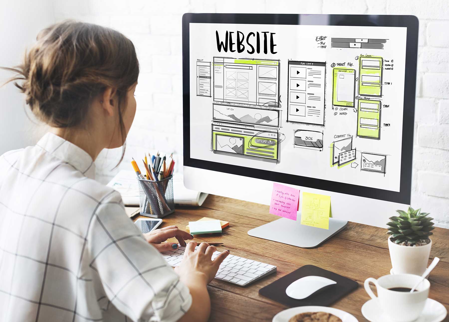
What’s Next for Your Web Design?
Step into your customer’s shoes for a moment. Remember that customers are interested in solutions to their problems, not your trophy case. What do you feel when you look at your own website? Does it clearly show you the actions you can take? Does it help you solve a problem or directly find what you need? Or do you feel lost?
Make sure your web design stands out as the most welcoming house on the block. While your competitors are turning people off, turn on your lights and welcome customers with the promise of solutions to their most important problems.
Photo by Finn Hackshaw on Unsplash