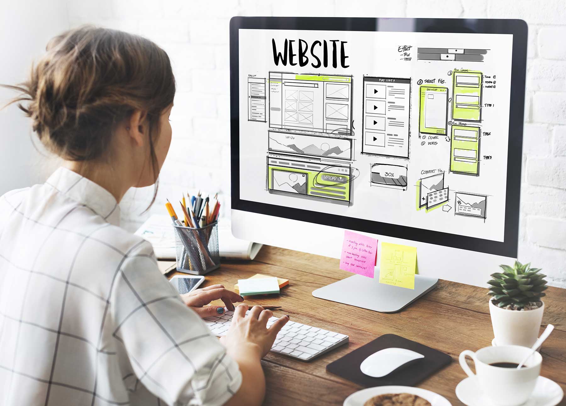
Minimalism is misunderstood. And minimalist web design is especially troublesome. Why? Because it’s not one specific aesthetic or an easily understood look. When you search for images of minimalism, the examples often feature mid-century modern furniture and decor. But these images can’t fully explain minimalism on their own. Besides, what does minimalism mean in digital art? We’re building websites, not chairs.
So, before we can build something together, we need to agree on definitions for important design terms. Let’s define minimalism for the purpose of building websites.
Intentionality in Web Design
The easiest way to describe minimalism is to say it’s the practice of eliminating distractions. It’s about focus. First, identify your goals or purpose and your needs. As you plan your project, whether it’s a poster, a kitchen, or a web design, ensure each item is chosen intentionally. Each addition must help to meet your goals or the needs you identified. Don’t bring anything else in.
Minimalist web design applies intentionality to these three areas: writing, text and image design, and page layout.
Write Short, Concise Sentences
It’s tempting to confuse minimalism for a serene, low-key style. So many pictures and representations of minimalism suggest that minimalism should be relaxing. That’s not necessarily true. Remember that minimalism is not about a single aesthetic. It’s about focus. You can be relaxing if you want. But you can also be punchy.
Always make your text as concise and brief as possible. Get to the point quickly with active verbs. Sting like a bee! And make each word as flavorful and true-to-you as local honey.
Choose Large Images and Text Treatments
Since minimalism is all about focus and intentionality, that means you will remove a lot of extras and you’ll potentially have a lot of extra space. Should you leave that space empty? You could! White space draws the eye toward your message like how plain gallery walls attract you to the art.
But you might also choose to fill the space like an IMAX screen with a single, impactful image. Go edge-to-edge to make the best use of the bright, colorful screens that are now common. This is my chosen approach.
Don’t stop with images. Consider displaying your headlines and text in font sizes larger than normal. Many websites set their body text in 14px. This is a nice size if your website must display thousands of words and really needs to economize on space. But it’s quite small. Try 16px for more comfortable reading and a bigger presence on the page. If you’re bold, try extra-large headline sizes like 60px or larger. These sizes look great and create a sense of immersion in your message.
Of course, all these sizes shrink proportionally for smaller size screens like mobile devices. While minimalism (focus) can lead to bigger sizes, or more space on big screens, translating the same approach to small screens means focusing your efforts on navigating the visitor from message to message as quickly as possible, leading them toward the resolution for whatever task they’ve come to you to work on.
Focused Web Design
For both large and small screens, choosing a focused page layout means displaying one thought or one action button per “screen”. This is a call-back to the idea of the newspaper fold, or the idea that some content near the top of your page layout is seen first and receives substantially more attention than anything else.
Users are now accustomed to scrolling or swiping down through content, so the attention is more evenly spread out. But the idea that each scroll or swipe should present no more than one thought is appealing and minimalist.
By focusing your page layouts on a single thought per section, you’ll be forced to remove extraneous items not related to that thought. This aligns with other minimalist choices like large images and font sizes.
Minimalism was never about removing everything. It’s about focusing on what matters the most. It’s about making difficult choices to remove things you might like, but don’t contribute to the overall effort. With minimalist choices, your web design becomes laser-focused on achieving the goals you set. The visual impression might look plain to some. What makes it stand out will be the unique messages spread through your images and text.
Photo by Bench Accounting on Unsplash